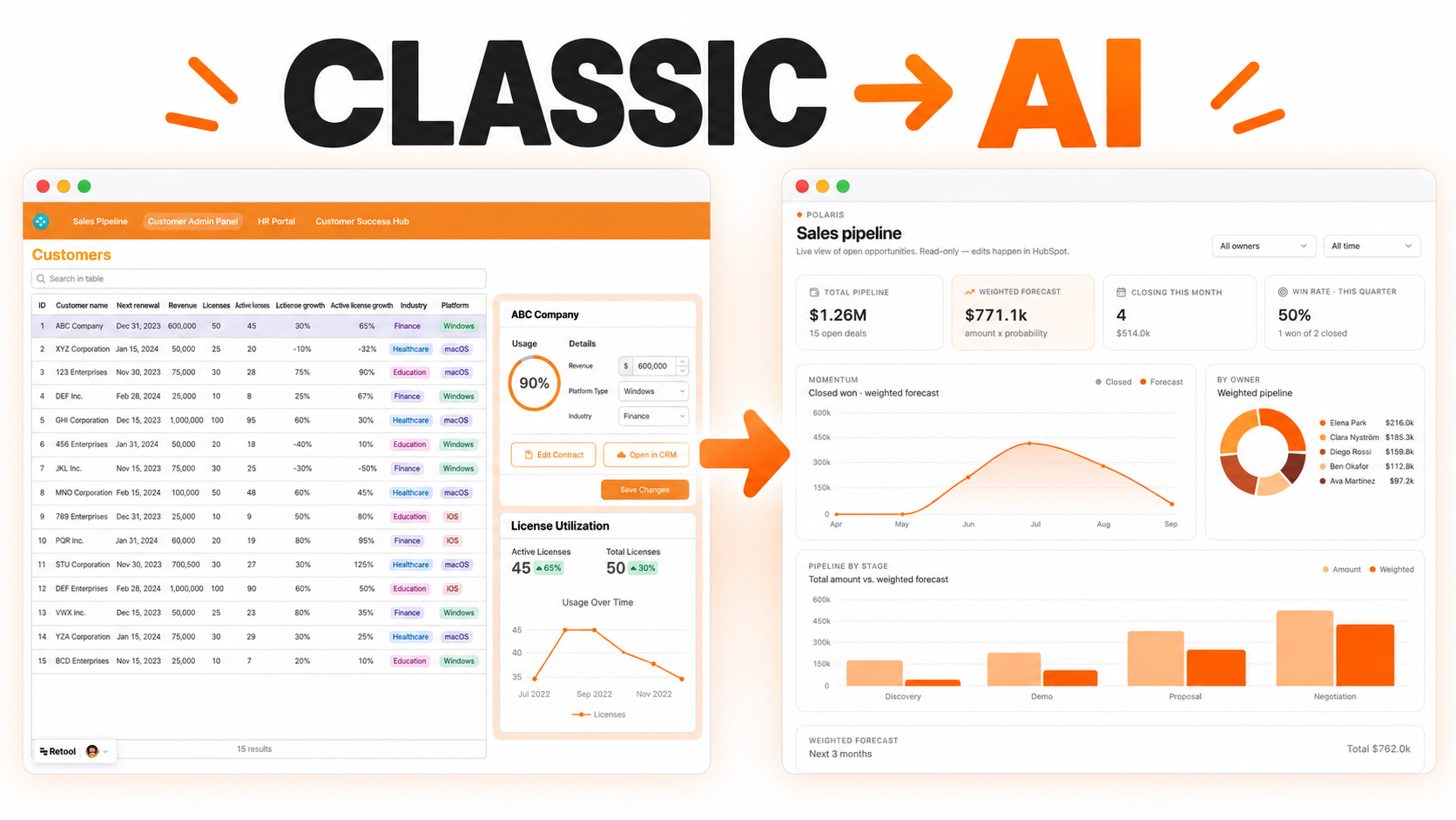
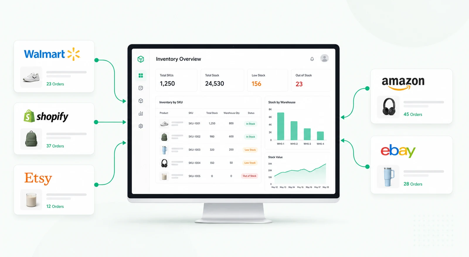
A project performance dashboard for comparing planned and actual hours, identifying variance, and drilling into monthly project-level detail.


Project plans and time records often live in different systems, making it hard to see where delivery effort is exceeding expectations. A planned-versus-actual dashboard gives managers a consistent view of hours, variance, and performance over time.
KPI cards summarize total planned hours, actual hours, completion rate, and overall variance. Managers can understand the portfolio position immediately before reviewing detailed projects.
A comparison chart shows planned and actual hours by month. Selecting a period can reveal the projects that contributed most to the difference, while a heatmap makes recurring overrun patterns easy to spot.
Retool can combine project plans, allocations, and time-entry data from databases, spreadsheets, or APIs. Charts, tables, filters, and calculated fields provide both the executive summary and the detailed evidence behind it.
We're officially approved by Retool and proud to be an agency partner!

Visit our blog to learn more about our innovative approaches to solving complex challenges.